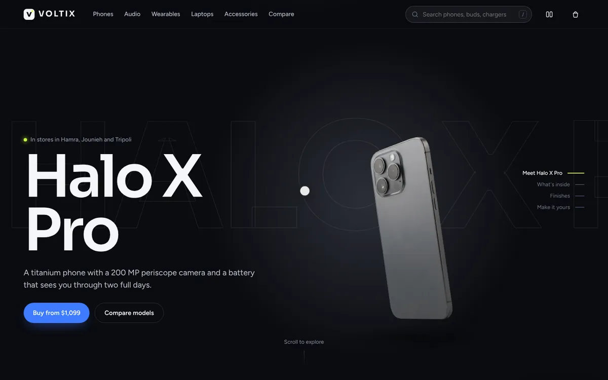
 Motion preview
Voltix
Flagship phones and audio in a dark product theatre, with a crisp, fast shop behind it
E-commerce
Shoppers tick Compare on up to four phones, which collect in a floating tray, then open a side-by-side spec table with a sticky header and label column, a highlight-differences toggle, best-in-row markers, best value / camera / battery badges and removable columns.
Use the Live / Loading / Empty / Error switch at the top of the demo to see every state.
Turns 'which one should I buy?' into a confident decision on the store itself instead of a comparison site, which lifts conversion on high-consideration products and nudges shoppers to the best-value model.
Motion preview
Flagship phones and audio in a dark product theatre, with a crisp, fast shop behind it
 Motion preview
Kinetic running store with a live bundle meter, size predictor and plan quiz.