Interactive — this is the real build running inside the page.Full screen
What it does
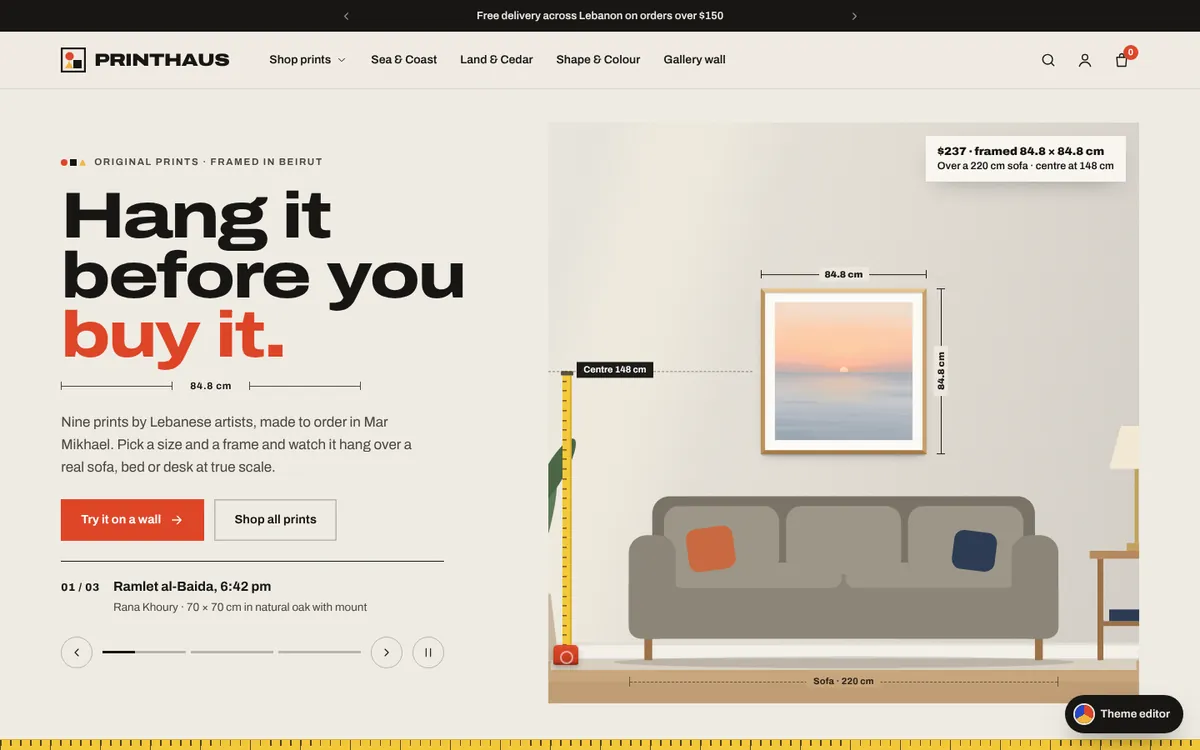
A Shopify theme design for a Beirut art print studio, built from Online Store 2.0-style sections. Pick a size and a frame and the print hangs over a sofa, bed, desk or console drawn to scale, with a measuring tape, a centre line and a two-thirds fit meter; drag it, change the wall colour, light it for the evening or drop in a photo of your own wall. A gallery wall builder, filters, cart drawer, one-page preview checkout with cash on delivery and Whish, an account page and a live theme editor all work end to end.
Signature interaction
Choose a size and a frame and the print grows on a to-scale wall over a 220 cm sofa, the measuring tape stretches to its 145 cm centre and a fit meter shows how close it is to the two-thirds rule.
What works in it
Wall preview at true scale over a sofa, bed, desk or console
Size, frame, paper and mount options with live framed dimensions
Drag the print on the wall with centre snap and a measuring tape
Two-thirds fit meter and an evening picture light
Try a print on a photo of your own wall, kept on the device
Gallery wall builder: pair, trio, grid or salon with up to 20% off
Theme editor: colour scheme, fonts, buttons, announcement and drag-to-reorder sections
Collection filters for availability, price, type, size and colour, with sort and grid density
Predictive search, mega menu and quick add
Cart drawer and cart page with free-delivery meter, gift wrap, notes and SITESUP10
One-page preview checkout with cash on delivery, card and Whish, plus a thank-you map
Account preview with orders, reorder and addresses
Motion preview
Screen recording of the live build, running on sample data.
Features inside this build
E-commerce
Product Configurator
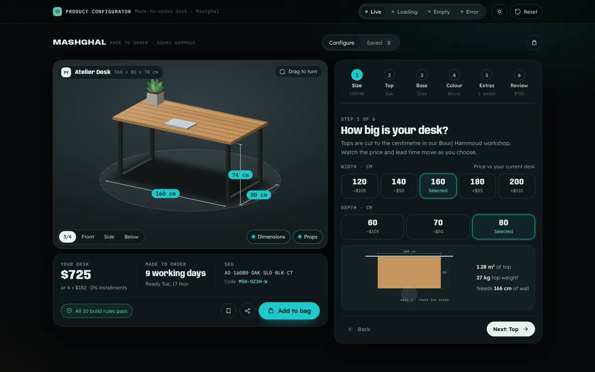
A step-by-step builder for a made-to-order desk from a Beirut workshop: size, top, base, colour and extras, with a 3D preview that redraws on every choice and turns under your finger. Price, lead time, ready date and SKU update live, build rules explain what can't be combined, and every design gets a shareable code.
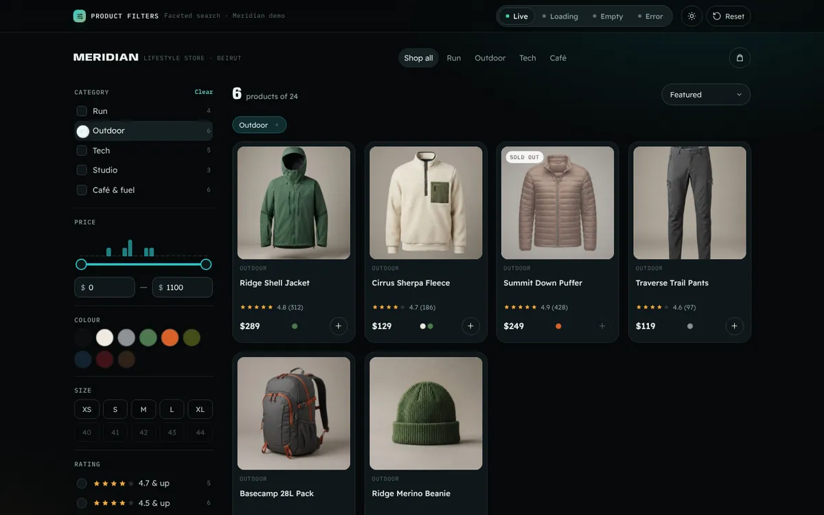
A 24-product catalogue with faceted filters for category, price (dual slider over a price histogram), colour swatches, size, rating and in-stock. Active filters show as removable chips, counts update live, the grid re-sorts with smooth FLIP animation and the whole state lives in the URL so a filtered view can be shared.
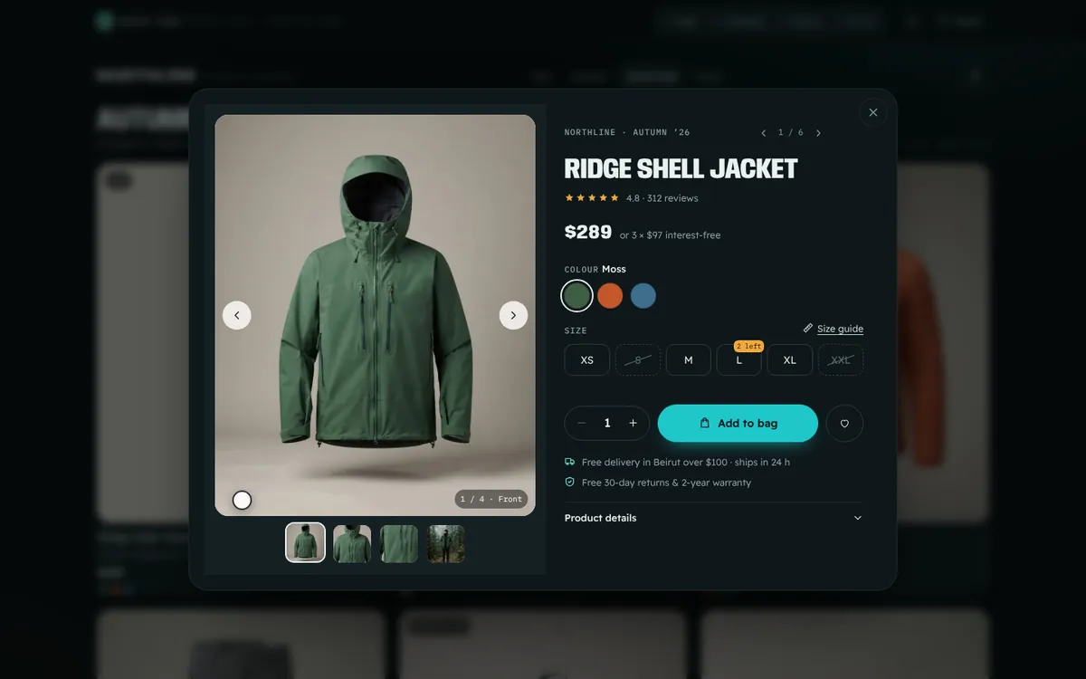
A product grid where Quick view zooms the card image straight into a modal (shared-element transition) with a gallery, colour and size selection, quantity and add to bag. It is fully keyboard driven: Enter opens, arrows browse images, Tab is trapped inside and Esc returns focus to the card.
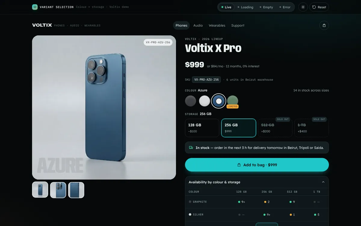
A phone product page where colour swatches swap the gallery with a circular colour-wipe, storage options show price differences and low or sold-out stock per colour, an availability matrix shows every colour × storage combination at a glance, and the SKU, price and URL update with each choice.